
A conference-program table can look orderly on a laptop and be nearly impossible to read on a phone. Session titles shrink, dates wrap unpredictably, and a citation at the far right slips off-screen. Making the page fit a narrow viewport is only the start: readers need to follow the argument, examine the evidence, and use the controls without pinching, rotating, or guessing.
For a historical-technical blog, review the published page, not just the draft. A post about an early speech-recognition system might include a scanned figure, an acronym-heavy comparison table, and footnotes that behave differently once the site’s theme renders them.
Start with a realistic reading pass
Open the page on a phone if you can. Check a narrow browser viewport as well: it can show where the layout begins to fail, though it won’t fully reproduce touch behavior, font rendering, or a mobile browser’s address bar. Test a common phone width and a narrower one at normal zoom. If the site allows text enlargement, increase the browser’s text size too. Don’t hide a broken layout by zooming out.
Read the first few paragraphs at a comfortable distance. Can you tell body text from captions and references? Do the lines feel crowded? Is it easy to find the next paragraph after scrolling? A page can meet a font-size target and still be tiring if the text is faint, line spacing is tight, or long technical strings break awkwardly. Start in portrait orientation. Turning the phone sideways may help with a complex figure, but ordinary prose shouldn’t require it.
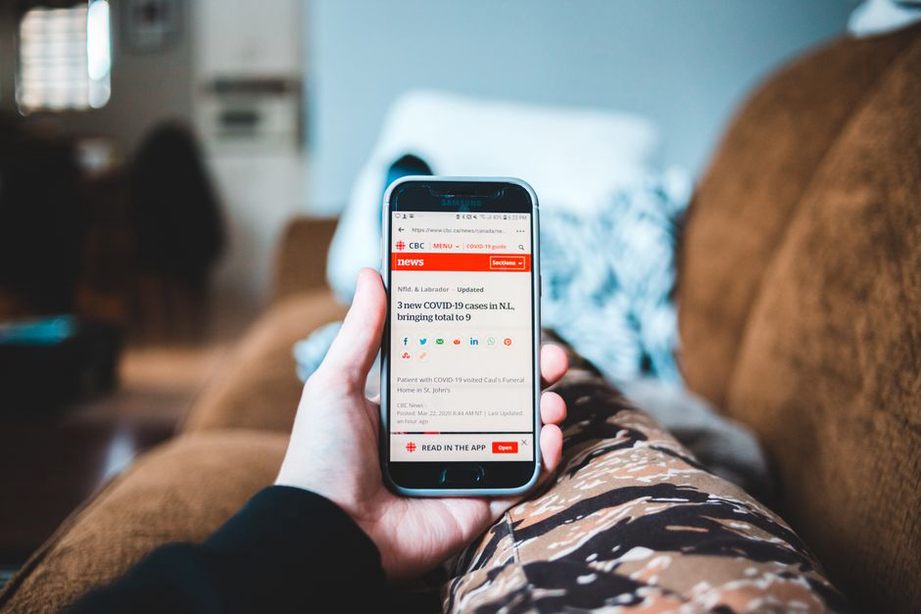
Check the page in the order a reader encounters it
- Opening screen: Are the title and start of the article visible, or does a large overlay cover them? Does the title wrap cleanly?
- Body text: Can you read paragraphs without panning sideways? Do headings mark real shifts in subject rather than interrupting every few sentences?
- Evidence: Can you read figure labels, table entries, quotations, and source details? If an image is too small, is its essential information available elsewhere?
- Navigation: Can you open the menu, follow a citation, and return without losing your place?
- Ending: Is it clear where the article ends, before unrelated cards, floating controls, or prompts appear?
Look for layout failures, not just small type
Horizontal scrolling is a warning sign. Move slowly down the page and watch for code fragments, long URLs, tables, or wide illustrations that extend beyond the screen. A table may reasonably have its own horizontal scroll area; the article around it should stay put. Readers shouldn’t have to pan sideways after every line of prose.
Inspect the spacing around headings, lists, and block quotations. A heading stranded at the bottom of the screen, with its explanation much farther down, makes the structure harder to follow. Tightly packed list items can make separate findings look like a single claim. Check superscripts and footnote links closely: tiny targets placed side by side are hard to select with a thumb.
Give contrast its own check. Pale captions beneath grayscale research figures may look fine on a bright desktop monitor but fade on a phone outdoors. Look at body text, links, captions, and text over colored backgrounds. Color alone shouldn’t be the only clue that text is a link or that a chart line represents a particular system.
Test figures and tables as evidence
Technical-history posts often rely on material designed for paper proceedings, not phone screens. In a scanned graph from a mid-2000s computer-vision paper, axis labels may vanish when the image shrinks to page width. If the site lets readers enlarge the figure, tap it. Is the larger version sharp, and can you close it easily? Then return to the paragraph. The prose should explain what the figure demonstrates without forcing readers to decipher every tiny label.

For a comparison table, check what each column contributes. A compact table showing method, dataset, and reported result may work if its labels remain visible and entries don’t break into single-letter lines. A wider table may need stacked entries with repeated field labels on mobile. Don’t quietly remove a column to make it fit: in a historical comparison, the dataset or evaluation condition may matter as much as the reported score.
Keep captions close to their figures. If a caption appears several screens below a large scan, readers may lose track of which illustration it describes. When an image carries essential information, check whether its alternative text conveys what a nonvisual reader needs to know, rather than simply announcing that a graph exists.
Try the interactions a reader actually needs
Tap links near line breaks, footnote markers, and controls that expand figures. There should be enough space around each target to avoid selecting its neighbor. Check whether a sticky menu or consent notice covers the bottom lines of text. If the page has a search box, archive filter, or comment form, open the phone’s keyboard and make sure the active field stays visible.
On a long article, test whether you can keep your place: scroll partway through, open a reference or enlarged figure, then go back. Losing the passage you were reading makes source comparisons frustrating, especially when a post moves between a researcher’s original claim and later commentary.
Record issues in a way that leads to a fix
A useful review note says where the problem is, what fails, and why it matters. “Table under ‘Evaluation’ extends past the right edge at narrow phone width; the dataset column is hidden unless I pan the whole page” gives someone more to work with than “mobile table looks bad.” Save a screenshot, note the device or viewport width, and say whether the problem affects one page or the site’s theme. If the behavior seems unusual, try a second browser.
Fix problems that block meaning before cosmetic inconsistencies: missing table cells, unreadable figure labels, obscured paragraphs, and links that can’t be used. Then repeat the reading pass, not just a spot check of the repaired element. After resizing a figure, for instance, confirm that its caption still sits with it and that the next paragraph doesn’t begin underneath a floating control.